If there’s one symbol that everyone knows Dalhousie for, it’s the distinctive eagle and shield. Taken from the university seal, the Dalhousie “crest” has been a core component of the university’s logo for the past 35 years, visible on countless signs, posters, merchandise and websites.
But it hasn’t looked exactly the same across those 35 years. Over time, it’s become more streamlined and simplified, and some details have changed shape, as evolutions to Dal’s look and feel have sought to align the university’s brand with a whole suite of transformations — societal, physical, digital and everything in between.

On the left is the official Dalhousie seal, from which the eagle and shield are taken. The shields that follow date to 1989, 2004 and 2014, respectively.
“A brand is about how we express ourselves to the world,” explains Matt Proctor, Dalhousie’s assistant vice-president of Communications, Marketing and Creative Services. “Our brand identity is made up of all the little cues that makes someone think, ‘Hey, this feels like Dalhousie University.’”
That includes the logo, of course, but also a whole lot more: fonts, colours, design templates and even guidance on how to express what makes Dalhousie unique to its constituents — whether they’re looking to study at Dal, work at Dal, donate or volunteer, partner or engage with the university in some other way.
“All these brand elements combine to ensure that Dalhousie is recognizable, wherever you come across us,” says Proctor.

That’s why the new look for Dalhousie’s logo — launched today as part of the latest refresh of Dal’s brand — is still instantly recognizable as the iconic eagle and shield. But what’s different about it is emblematic of the approach for the brand refresh overall: cleaner, simpler, better designed to meet the requirements of an increasingly digital world and built around the latest web accessibility standards. Indeed, the new brand is being touted as more accessible than before.
Dal President Deep Saini says this is an ideal time for this “freshening up” of Dal’s brand — following Dal 200 celebrations in 2018, the launch of the Third Century Promise strategic plan last year, and increasingly demands for digitalization that change the way people engage and raises the bar for accessibility.
“This is an exciting milestone as we forge ahead in fulfilling our shared promise and showing the world what Dalhousie has to offer,” says Dr. Saini.
A fresh outlook on Dal's promise
Third Century Promise, Dal’s strategic plan, asks what it would take to lift Dalhousie into the community of the world’s greatest universities, and outlines strategies to help achieve that ambitious goal. Alongside this work, the team at Communications, Marketing and Creative Services (CMC) has engaged in an update to the Dalhousie brand to match — a refined and refreshed expression of what it is that makes Dalhousie distinct, and why it means so much to so many people.
“In the many conversations we’ve had over the past several months — with stakeholders on campus, in the community, with prospective students — we’ve heard the same things over and over again: a confidence in what Dalhousie is capable of, and that people want to hear us talk about it,” says Proctor. “They’ve asked us to be bolder, reach further and be more inclusive.”
Working with local marketing agency M5, the CMC team relied on existing and new research with key audiences and stakeholders to develop an updated visual brand identity, clearly defined positioning and a distinct brand promise, all meant to help shape and inform how students, partners and collaborators experience the university.
“In an increasingly digital world, the pieces of a brand need to work across platforms and be easily recognizable no matter where you encounter them,” says Damian Bonse, executive creative director at M5. “This new brand considers al this and brings it together with the incredible, life-changing moments, discoveries and knowledge that make Dalhousie University such an exceptional place.”
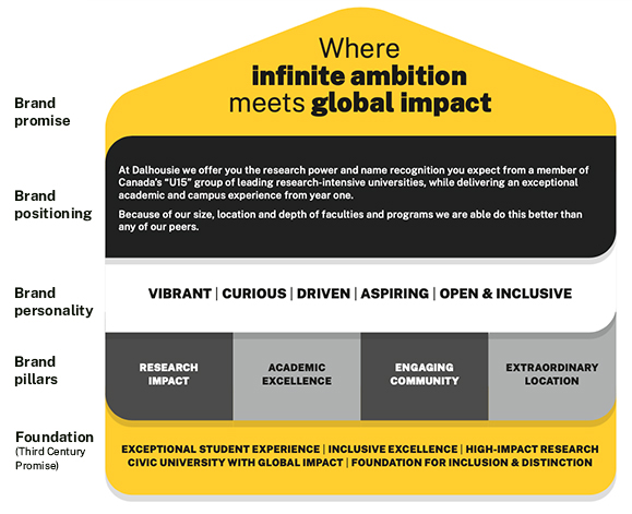
The brand is built on a foundation of Third Century Promise’s five pillars and the four related pillars of the brand — aspects of Dalhousie that define and shape people’s experience with the university. These include:
- Research impact: A world of change begins at Dalhousie
- Academic excellence: Built to help bright minds excel
- Engaging community: Community is more than simply the space we share
- Extraordinary location: A place filled with transformative moments

On this foundation, the brand adds personality traits and a positioning statement outlining what Dal can uniquely offer its students and its communities. And at the very top of the brand is its promise — a commitment that sets the expectation of what people can expect from the university:
Dalhousie University is where infinite ambition meets global impact
“This is a place where unique experiences come together,” says Proctor. “There’s no shortage of ways in which Dal brings together the best of both worlds, whether it’s its size, its focus on both research and teaching, or in the ways it allows students to bridge perspectives and disciplines."
Explore the revised brand
Visit the brand website for brand guidelines, visual assets, logos and more.
Making an impression
Why does a university have a brand in the first place?
The world is complex and cluttered, and the ways people will learn about or encounter Dalhousie and its work are varied and complex as well. Against this backdrop, consistency and alignment are key. Whether it’s with an advertisement or a website, a brochure or a business card, the brand ensures people recognize “Dalhousie University” when they see it.

To accomplish this, Dalhousie’s brand refresh includes a comprehensive brand system built with both alignment and flexibility in mind. Among the brand’s more novel features is a new shape — dubbed the “Dalcon” (short for “Dalhousie icon”) — that’s borrowed from the logo’s eagle and acts as a “brand cue” across the creative platform. And from colours to graphics, a strong focus on accessibility flows through all elements.
“Especially as we work in an increasingly digital world, it’s vital that the way we communicate is accessible to everyone,” says Keri Irwin, Dalhousie’s director of marketing. “That’s why we’ve prioritized a more legible font, colours that better meet visual standards, and other modifications that align with Web Content Accessibility Guidelines.”

Which brings us back to the logo itself. Given that the way people experience Dal’s logo could be as big as a billboard or as small as a smartwatch screen, the refreshed logo aligns with broader trends towards simplifying logos and design. With cleaner, rounded and geometric lines, the logo aims to feel more approachable and contemporary while also meeting the requirements of digital communications. In testing, people told Dal’s project team that the refreshed logo feels bolder, more vibrant, progressive, confident, engaging, unique, and gives the impression of quality when compared with other university logos. There is also, for the first time, a uniquely international version of the logo to position Dalhousie among its Canadian peers globally.

The revised logo will also serve as inspiration for two unique art projects being commissioned to create more inclusion and diversity in Dal’s visual representation: one in partnership with the Mi’kmaq community, and the other in partnership with the African Nova Scotian community.
“While we always strive to create words and visuals that represent the diverse community that makes Dalhousie exceptional, we also recognize there is more we can do,” says Julie Hallett, associate director of brand and marketing, who says further details on the art projects will be shared in the weeks to come. “We are both grateful for these engagements and excited to see this work come to life over the next several months.”
Bringing the brand to life
In additional to accessibility and inclusion, sustainability is also top of mind for the new brand. CMC is asking people to use up existing brand materials before moving onto new ones, saving both costs and paper/printing.
People will see the new brand materials in digital spaces first (as they’re quickest and easiest to update) but soon it will start showing up in all sorts of other locations. The CMC team is also welcoming assistance in identifying materials that should be updated. If you see something that requires an update, you can let the team know by emailing dalbrand@dal.ca.
Learn more: Explore the refreshed Dal brand
Flashback file: Selecting Dal's logo

Dalhousie News, 1988
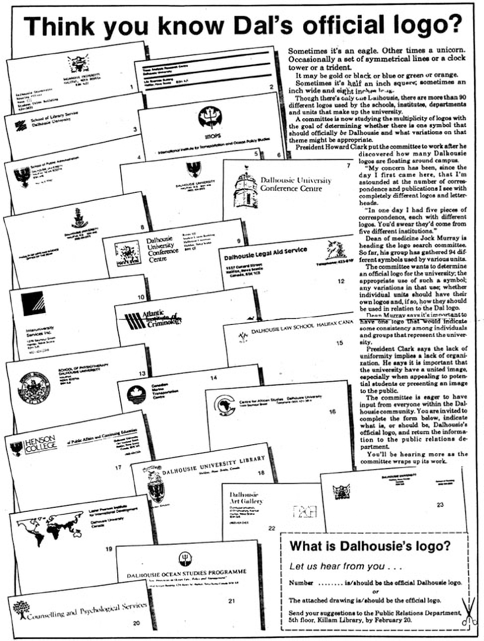
In 1988, Dalhousie News ran a piece inviting members of the Dal community to mail — yes, old fashioned mail — their views for what should be Dalhousie's logo.
At issue was the fact that there was more than 90 different logos in use by various Faculties, departments and units. Howard Clark, university president at the time, recounted that in one day he received five pieces of mail with five different Dalhousie logos. "You'd swear they'd come from five different institutions," he said.
Among the more interesting logos circulating at the time included various takes on squares and lines, a unicorn head — like the eagle and shield, also taken from the Dalhousie crest — and a trident.
A committee chaired by Dean of Medicine Jock Murray was tasked with sorting through the various options and, in 1989, the eagle and shield was officially part of Dal's first standard logo.


