
, Canada Research Chair in Data Visualization in the Faculty of Computer Science, and PhD student Leonardo Christino. (Provided images)")
Our understanding of the well-being of Nova Scotians just got a whole lot deeper thanks to a new tool developed by Dalhousie researchers in collaboration with non-profit organization Engage Nova Scotia.
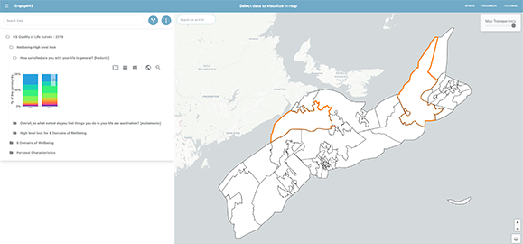
The Wellbeing Mapping Tool takes North America’s largest single data set on well-being and quality of life and provides a simple and interactive way for users to identify trends and insights into quality of life across the province.
Identifying trends, visualizing data
Fernando Paulovich, associate professor and Canada Research Chair in Data Visualization in the Faculty of Computer Science, and PhD student Leonardo Christino were approached by Engage Nova Scotia with the task of developing a platform to host survey data with responses from close to 13,000 Nova Scotians to more than 200 questions about their quality of life.
Undertaken in 2019, the survey asked participants questions, ranging from their opportunities in education, interactions with the health-care system and job satisfaction alongside questions about their experiences of discrimination, loneliness and their confidence in institutions.
Conducted prior to the COVID-19 pandemic, the survey identified trends connected to loneliness and isolation in the province as well as indications that those with lower incomes tend to struggle in different ways than those who earn more.
The challenge was developing a tool that could make sense of such a large data set in a way that is easy to understand and use by people across the province.
“A basic way of doing this would be exporting a spreadsheet but this is very hard for most people to actually use and understand in a meaningful way,” Leonardo says. “We developed a way of visualizing data in a very easy sense so that residents in Nova Scotia and partners would be able to understand the data and its potential so that they have opportunities to develop ideas around it.”
An interactive tool
Leonardo joined Dr. Paulovich’s Visual Analytics and Visualization Lab as a PhD student from Amazon where he worked as a backend engineer. He credits his experience in research and industry for his understanding of how organizations can use tools like this one to enhance their operations. He found this particularly useful when developing some of the more interactive features of the tool.
“We wanted to develop features that could show what the data is capable of,” Leonardo explains. “For example, this vs. that. That is, I select and compare two different parts of the data though the mapping tool. Another is, by selecting the region where I live, I can understand my situation vs. everyone else in the province. I can also search for my own postal code. Using these interactions, things got much bigger in terms of people looking at the data and experimenting.”
The team hopes to continue to develop the tool and incorporate future survey data from 2024 to make it even more robust and useful for those who are seeking analysis and visualizations.
“Working with highly skilled and dedicated partners in Leonardo and Fernando has enabled us to make the survey results available in a way we couldn’t have without them. We have appreciated their nimbleness and creativity every step of the way,” Danny Graham, Chief Engagement Officer, Engage Nova Scotia, says. “Residents of Nova Scotia can visualize the survey results in ways that are meaningful and useful to them, which is essential to us. We look forward to continuing to grow and refine the tool in partnership with them with the support from Mitacs for this work.”
Application in other areas
This is one of many projects coming out of Dr. Paulovich’s lab that focuses on data visualization and democratization. Essentially, helping people to understand massive amounts of data in an approachable way.
He argues that the research methods used in handling Engage Nova Scotia’s data can be applied to a wide range of sectors and challenges.
“I will mention a couple of other projects that we are currently engaged in,” Dr. Paulovich says. “We are working with Halifax Regional Municipality (HRM) on a similar but different project to map data to help them better understand the factors, for instance, traffic or existence of parks, that affects quality of life. Then, in collaboration with Dr. Joanna Mills Flemming from Dalhousie’s Department of Mathematics and Statistics we are exploring how we can use a visualization tool to understand how sharks and other marine animals move around the Bay of Fundy.
“The idea across all three of these projects is the same, to create a system for exploratory analysis. Where you have a complex data set, and we make it easy to understand for everyone so that they can make decisions based on data.”
Comments
comments powered by Disqus