
Little motes billow into our atmosphere every day. They pump out of car exhausts and coal-fired factories. Hot desert winds blow them into the air. They form chemically as forest gases rise into the sunlight. They are all potentially dangerous to our health.
We’ve known about air pollution for years, but now, for the first time, Dr. Randall Martin from Dalhousie’s Department of Physics and Atmospheric Science and Aaron van Donkelaar, a Phd. candidate in the department, have produced a map showing long-term global levels of this fine particulate matter.
“We are looking at parts of the world we just haven’t seen before and the levels we are seeing are surprisingly high in some areas,” says Mr. van Donkelaar. “The impacts of that are potentially quite high for the quality of human life for a lot of people.”
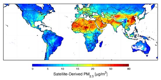 |
| Global map showing concentrations of fine pollutants. |
In one of the most dramatic instances on the map, 50 per cent of the population in Eastern China and 38 per cent of people in Northern India, were affected by high concentrations of pollutants, far exceeding even the weakest of World Health Organization standards.
Particle size is critical to the importance of this map to health researchers, because they are small enough to get past the body’s defenses. Fine particulate matter, also known as aerosols, measure less than 2.5 microns in diameter – about a third the size of a red blood cell.
Penetrate deep
“They are the particles that are most likely to penetrate deep into our lungs where they can then cause more damage than larger particles,” says Dr. Martin. But despite their size, fine particulates can be seen from space. “That’s also important,” he continues, “other pollutants, like ozone, are much harder to see down at the surface from space.”
Turning this data into a map was no mean feat. Satellite remote sensing has come a long way, but there were kinks to work out.
Instruments on NASA’s Terra satellite began collecting global data on aerosols in 2000. Terra circles the globe 15 times per day, scanning the Earth below and measuring how these pollutants obstruct sunlight from the ground to the upper reaches of our atmosphere.
Dr. Martin and Mr. van Donkelaar analyzed data gathered from NASA satellite readings over a six-year period from 2001 to 2006. With input from NASA scientists (listed as co-authors on the paper), they combined satellite data with a global 3-D model of the atmosphere and compared it against available ground data.
'Uncertainties'
“There are uncertainties,” explains Mr. van Donkelaar, which they spent a lot of time trying to reduce in their map. “The desert is a very different type of surface than, for example, a forest.” he says, “When the satellite’s observing overhead, it has to know how much light has bounced off the surface versus how much has been bouncing off the atmosphere.”
Determining this is difficult and can cause errors, although Mr. van Donkelaar believes the sheer volume of data adds a huge benefit to the project. “One the reasons we did the longterm average is because of the errors and so taking that much data together, we have more confidence in it.”
Future work on the map will involve mapping trends on how concentrations of these pollutants change over time, where they rise and how they fall in the Earth’s atmosphere.
Dr. Martin, who leads the Atmospheric Composition Analysis Group -- the small group of Dal researchers who work on atmospheric modeling projects -- has been busy since the map was published. Academics, the media and health organizations have been keen to make contact.
Linking air pollution and health
“It’s been exciting for us to start developing linkages between atmospheric science and the health community,” says Dr. Martin.
Currently, they are working with Health Canada to map levels of fine particulate exposure in Canada and with a World Health Organization project examining links between air pollution and health. They also recently established connections with Chinese scientists for future data exchanges.
“This type of publicity really does help,” says Dr. Martin. One might even say it’s put this group of atmospheric scientists on the map.
Comments
comments powered by Disqus